Celia Hart's blog about what's going on in and around her studio.
Art, printmaking, inspirations, gardening, vegetables, hens, landscapes, wild flowers, East Anglia, adventure, travel.

Showing posts with label woodblock prints. Show all posts

Wednesday, 10 December 2008

Bargain hunt

I love auctions and often surf through online catalogues to see if there's anything worth viewing and perhaps bidding for. Last week I spotted a lot which definitely got me interested and after visiting the auction rooms I was determined to bid – but I would be on the road up to Liverpool on Saturday! I'd have to put in a 'commission bid' and trust the auctioneer to bid for me. I've never done this before, I cautiously filled out the form and hesitated over the price to put as my limit. The upper estimate might not be enough but I didn't want to pay too much.

On Sunday evening I checked the auction web site, the price realised for 'my lot' was below the figure I'd put on the form – I must have won!!!! Hurray!!!! So on Monday I collected my bargain buy . . .


. . . a couple of tatty old picture frames . . .

containing two Japanese woodcuts :-) I'm chuffed to bits! (it doesn't take much)


The first one is by . . .


Hiroshige! Well, probably it's Hiroshige II (1829 - 1869) or Hiroshige III (1842 - 1894) – not the main man Ando Hiroshige (now that would be amazing). Hiroshige II was the talented pupil of Ando Hiroshige who became his master's adopted son and married his daughter. When the couple divorced Ando Hiroshige's daughter married another pupil of the master who took the name Hiroshige III. The confusing thing is that all three artist's signatures are very similar! Lot's more research is needed!
see below

In the background of this print is a crowd standing on a bridge watching a firework display. I love the woodgrain texture across the night sky and the sense that the crowd is brightly lit from behind.


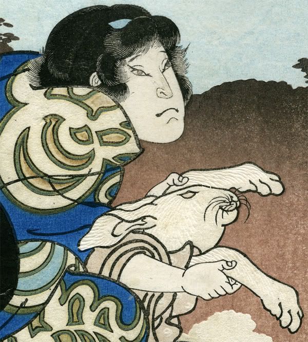
In the foreground a woman (I think?) crouches in a covered barge – why is she hiding? I wish I could read Japanese and translate the title! It's so clever how the hair is printed first in a translucent dark grey and then a solid black. That little wisp of hair at her temple is so cute, is it to show she is slightly dishevelled? And the way the fabric pattern is printed is gorgeous.


The second print is a bigger puzzle. There is a note on the mount saying it is by Yoshichikaan artist I can find little about. Prints I've found purporting to be by him have a signature which don't match this . . .


The scene of sumptuously dressed ladies walking by a river in which there are half naked men, is cheeky and extremely decorative. I'll have to get the title translated and find out what it's all about! There is so much going on in the design, the detail in the fabric patterns is awesome – amazing skilled work.


A bargain!


Postscript: 18 December 2008
This is what I've discovered so far:

The first print is most likely to be by Hiroshige II, the apprentice and adopted son of Ando Hiroshige. He carried on the master’s great themes and scenes and produced high quality work but not designs of great originality. The signature, mid right, is definitely ‘Hiroshige’ but this was used by all three ‘Hiroshiges’ at some point in their careers. However the style of the signature panel and the lozenge seal seem to be that of Hiroshige II 1829-1869.
The subject is a popular one for printmakers: watching fireworks on the Ryogoku Bridge and from pleasure boats on the river below. Beautiful women in the pleasure boats is another favourite. My hunch is that this is the central panel of a large triptych, as this is is the central part of the boat. Stylistically I would think this dates from about 1860. Each of the three prints would have the title and signature and stand alone as a design – of course the chance of all three images staying together and in good condition for 150 years is slim so a complete set would be far more valuable! But it’s a lovely image by a well known printmaker. I would guess the title refers to the Ryogoku Bridge, pleasure boats, beautiful women, fireworks, or something of that ilk!

The other print, showing a grand lady and attendants beside a river is supposed to be by Yoshichika. But I can’t find out much about him – his signature is shown lower left but I haven’t been able to check this against an authenticated print. I found a reference to an artist called Ichi Yoshichika 1787 – 1872 and a note saying nothing more is known about him!
But I love the depiction of different textile designs and the ‘Onna norimono’ or noblewoman’s palanquin
great reference for one here. The title of the print, top right, might refer to a woman by name with her attendants and bathers. Or it may refer to a well known story of the time.

With a bit more delving I hope to find out more!


Postscript 20 June 2017
While watching an excellent programme about Japan on TV last night, I was inspired to search on google for more information about the 'Horoshige' print. I know that the image must be part of a triptych and depicts people watching fireworks of Ryogoku Bridge. To my surprise in google images I spotted this!


Enjoying the evening cool with fireworks, Ryogoku Bridge (Ryogoku noryo ohanabi)

Utagawa Hiroshige
Japanese, 1797-1858
Yamadaya Shojiro, publisher
Japanese
Enjoying the evening cool with fireworks, Ryogoku Bridge (Ryogoku noryo ohanabi), 1847-1852
Polychrome woodblock print
Plate: 37.3 x 24.3 cm (14 11/16 x 9 9/16 inches)
Gift of Marshall H. Gould 46.293.11B

So the mystery is solved, I have one third of a  Utagawa Hiroshige's triptych

Tuesday, 15 January 2008

Layers of colour

Layers are very useful when working on digital illustrations, and printmaking with multiple blocks is a very similar concept. So it is a natural step to use the "layers" in Photoshop when I am working out the design for another colour lino block for the Fieldfare/Running Deer print.

First I printed a proof of the black lino block and scanned it. I then "draw" the red block design over the top on a separate "layer" which is slightly transparent so that I can see the black design underneath. The next step is to print out the red block design, transfer it to the lino block and cut the design.


This is a detail of the 'Running Deer' red block printed over the pale blue oak wood block print . . .


I decided to soften the red and blue by over printing with a third layer of colour – the oak block this time inked with translucent pale grey. I masked the area over the sun so that it remained a strong red. When this layer was dry I could overprint with the black lino block. Of course not all the imprressions work out, and I was experimenting with the transparency of the ink and the pressure needed on the barren, but I had a three good prints of both 'The Arrival of Fieldfares' and 'Running Deer'.


I needed one image that represents the direction of my work in 2008 to go next to my entry in the Cambridge Open Studios 2008 Guide Book, this is the one that I selected. July may seem a long way off, but on Sunday the starting whistle blew for Cambridge Open Studios artists to prepare for opening their studios to the public in the summer. A well-oiled admin process got into gear; artists gathered to fill in forms and talk of marketing and websites and sales and stuff; and the show got on the road!

Tuesday, 28 August 2007

Contemporary Woodcuts

I spent the Summer Bank Holiday weekend at a printmaking workshop at Gainsborough's House in Sudbury. The three day course, 'Contemporary Woodcuts' led by illustrator and printmaker Mark Hudson, was held in the Print Workshop in the walled garden behind Gainsborough House. Inspired by an introductory talk on Friday evening we arrived on Saturday keen to learn as many techniques as possible.


After "warm-up exercises" making marks on a balsa wood block using only our finger nails (and teeth), we experimented in making marks using nails, hacksaw blades, wire, hammers, in fact anything we had to hand. Then it was on to inking techniques and the use of paper masks on the blocks. We had been asked to bring in a photograph of a landscape, in the afternoon Mark described his technique for interpreting a landscape and distilling it into a two colour print design. This is my design based on the standing stones at Langass Loch on the isle of North Uist in the Hebrides, with Ben Eavel in the distance.


On Sunday we started work on a second, larger design and we experimented with making marks on the blocks using power tools. A bench was set up in the garden and we attacked our wooden blocks with an electric drill fitted with various grinding wheels and wire brushes - great fun! My design is based on a photograph of the seaweed covered rocks on the southern tip of South Uist.


Monday saw everyone in the Print Workshop an hour before the official start of the course - it was a frantic race to get as much work done as possible on both of our designs. Mark threw in lots of extra ideas and possiblilities as he went round to see what we were up to. There was so much to do and we had to start packing up at 3pm!!! The drying racks were crammed full of prints and we eagerly used each others' ink mixes to make one last impression on our prints.


When every last smear of ink had been wiped up and all the tools cleaned and put back in the correct place (under the watchful eye of the fantastic Print Workshop technician Sue Molineux) we laid our favourite prints out on the grass in the shade of the 400 year old mulberry tree, and sat down with a welcome mug of tea to discuss printmaking suppliers and chisel sharpening, and to admire each others work. It was amazing that given the same brief and materials we each created completely different styles of work - which showed just how versatile woodcut printmaking can be. These are my favourite prints from my two designs - very much works in progress, I'm looking forward to working on them over the weeks ahead.


Thursday, 15 March 2007

Japanese Inspiration


Japanese woodblock prints are a great inspiration to me. I admire the skills of the artist/designers, block cutters and printers who produced them. And I enjoy finding out the story behind the picture - for instance sometimes a serious looking image turns out to be a silly joke involving a pun and a celebrity actor dressed as a fireman!
This is a detail of a woodblock print by Hirosada. I bought it at a local auction last year and after a bit of research I found out that it is one of a series of prints designed by Hirosada in 1852 illustrating a play based on the story of the selection of the 12 animals of the Japanese zodiac. This one shows the hare - and you can see the technique of blind embossing used to depict the hare's fur. The fine line detail is amazing, as is the combination of blind embossing (printing from an uninked block onto damp paper) with colour to create a subtle 3D effect to the patterns on the kimono. This print was throw-away publicity material for a theatre production 155 years ago in Osaka, Japan - it's also a beautiful example of the skills of the artist and craftsmen who produced it.